
FOUR DIRECTIONS / ONE RECOVERY PROBLEM
Different ways to work.
Which one feels right?
Compare the structure, personality, and decision flow—not just the colors. Each concept follows Maya’s $128 course purchase.
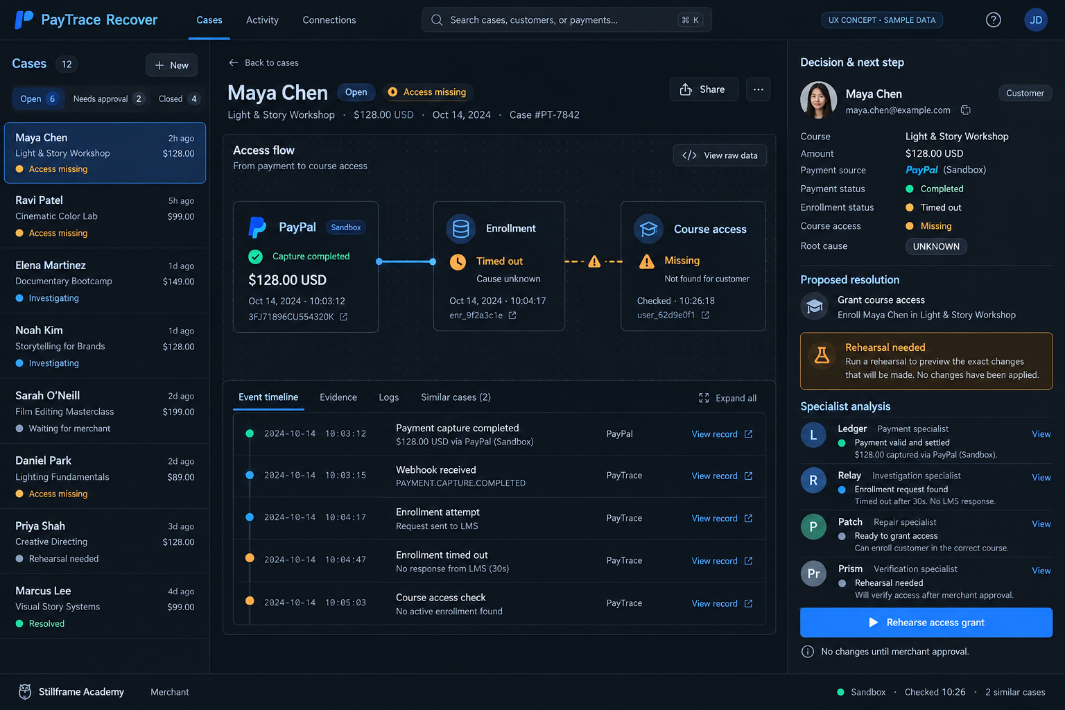
Signal↗
Dark · Technical · Connected
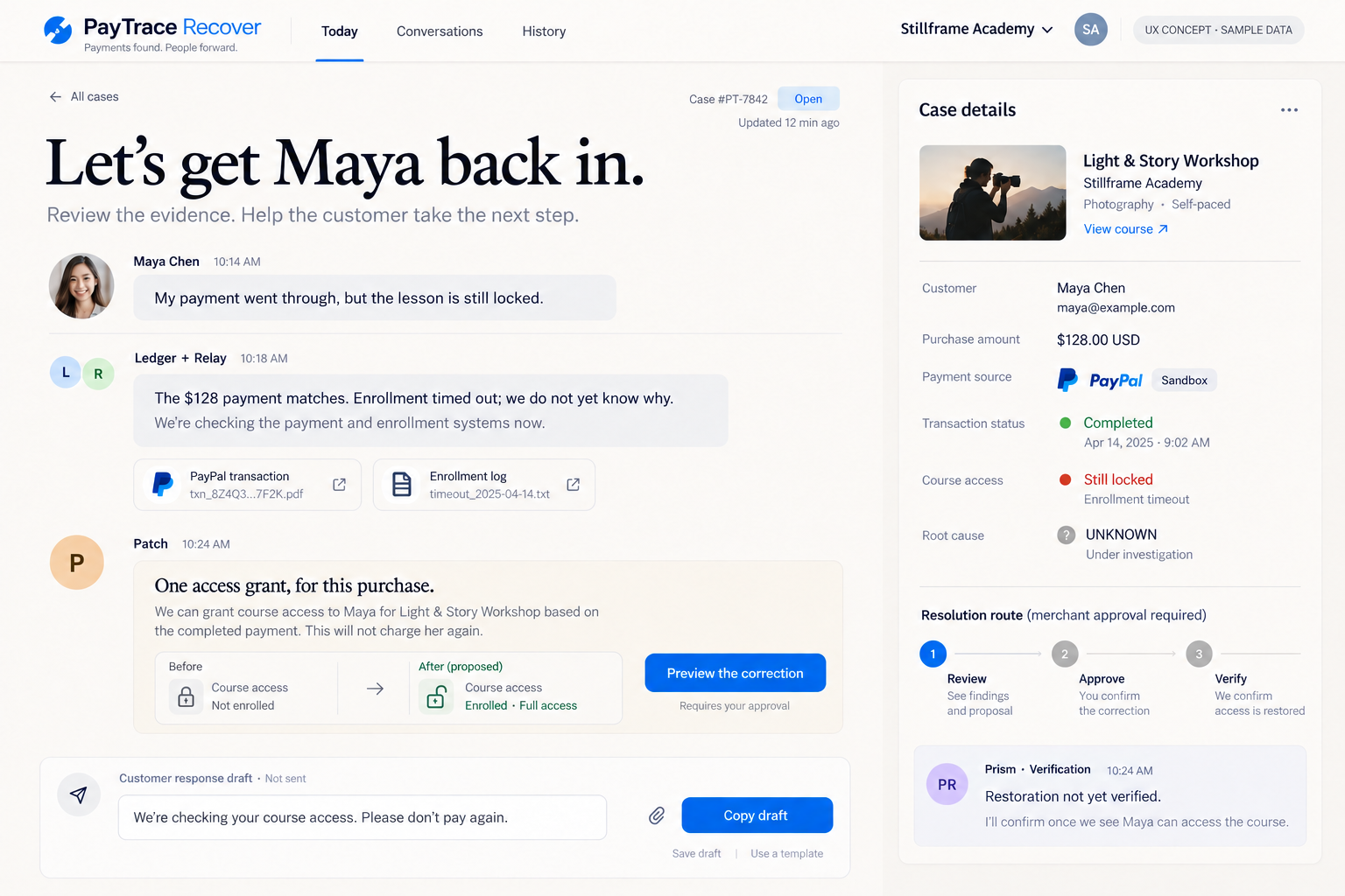
Concierge↗
Warm · Conversational · Human
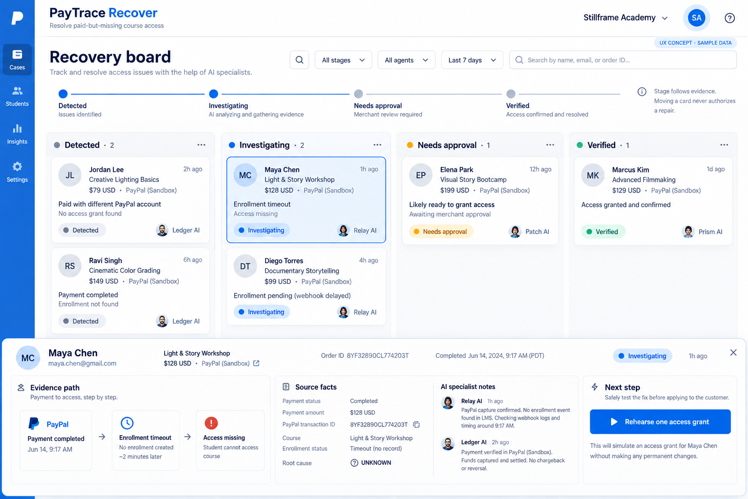
Flow↗
Visual · Team-oriented · Structured
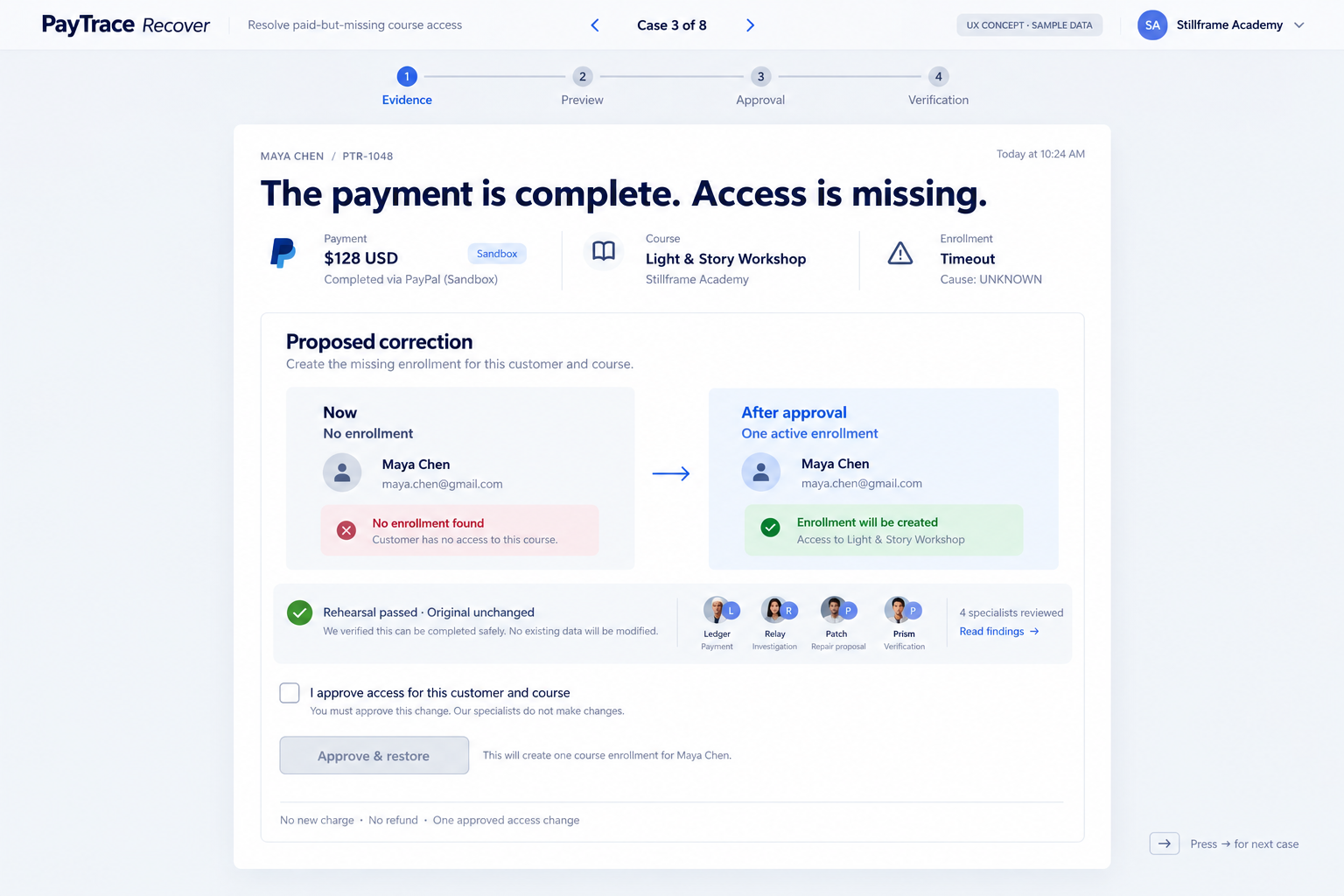
Focus↗
Minimal · Calm · Sequential
Focus for everyday recovery, with Signal’s evidence view when a case needs deeper investigation. Concierge is the warmest option; Flow offers the strongest overview for a team.
A / EVIDENCE FIRST
Signal — Follow the failure across systems.
A spatial evidence trail puts payment, enrollment, and access in one view. A decision inspector keeps the proposed next step close to its sources.
Where it fitsBest for detailed investigations and technical operators.
Design tradeoffMore information on screen; needs careful mobile simplification.
↑ Compare all fourB / CUSTOMER FIRST
Concierge — Start with the person who needs help.
A customer conversation leads the experience. Specialists explain their findings in context, while a quiet case dossier holds the payment and access facts.
Where it fitsBest for solo merchants and support-led recovery.
Design tradeoffLong conversations can make comparisons across cases slower.
↑ Compare all fourC / WORKFLOW FIRST
Flow — See what needs to move forward.
A recovery board separates detection, investigation, approval, and verification. A review drawer opens the evidence without losing the team's place.
Where it fitsBest for teams managing several cases at once.
Design tradeoffBoard movement must follow evidence; it cannot authorize a repair.
↑ Compare all fourD / DECISION FIRST
Focus — One case. One considered decision.
A single review sheet presents the facts, a before-and-after preview, and explicit approval. Extra detail is available when needed.
Where it fitsBest for fast, deliberate merchant review and a mobile adaptation.
Design tradeoffLess visibility into the whole queue during a case review.
↑ Compare all fourControls inside these images are illustrative. All people, dates, records, and system events are fictional samples. Additional navigation and integrations shown are design possibilities, not supported features. Exact copy, identity checks, timestamps, status counts, and approval states will be validated when implementing the selected direction. Customer replies remain drafts; no messages are sent.
Try the existing working demo ↗